Branding Design
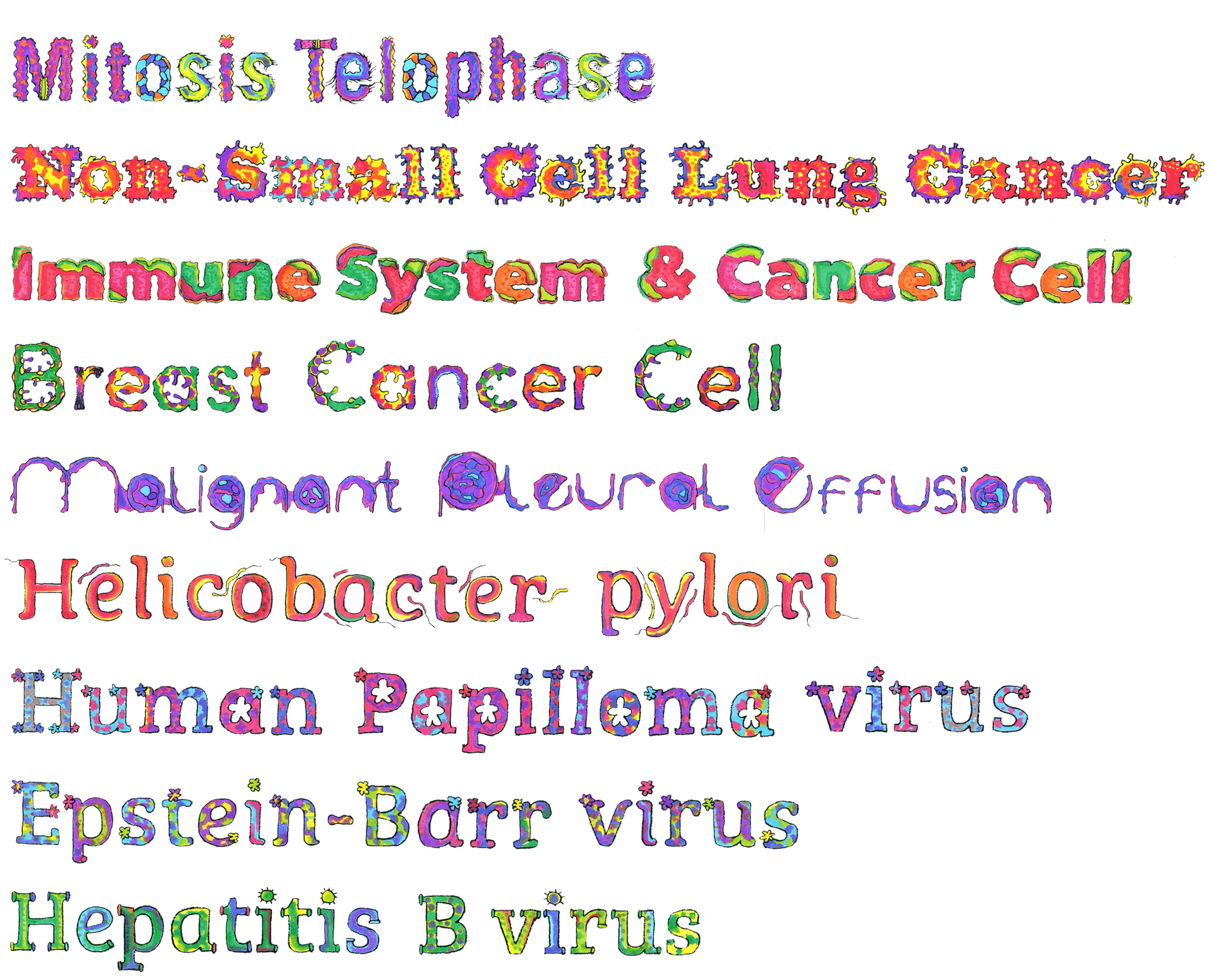
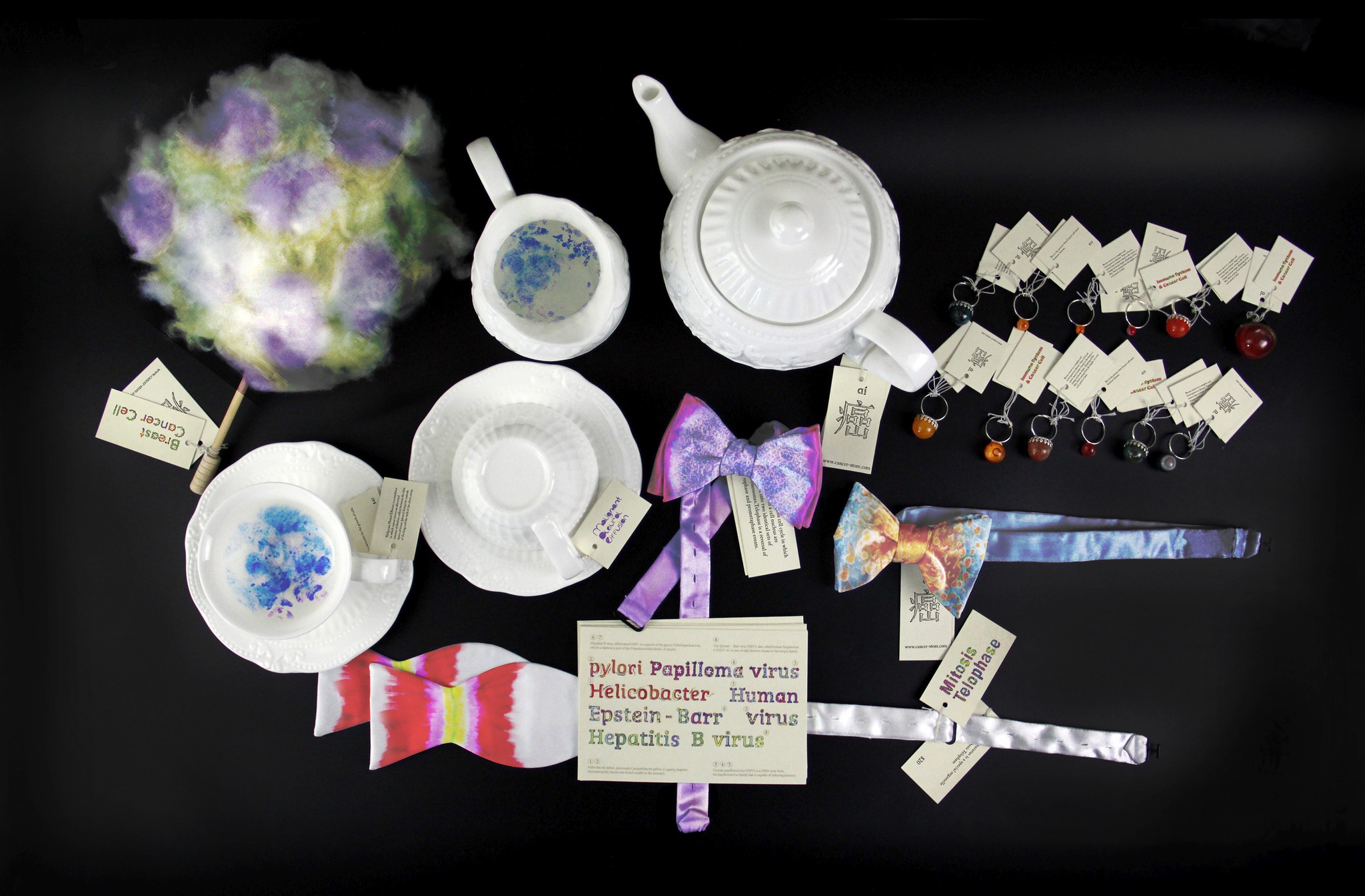
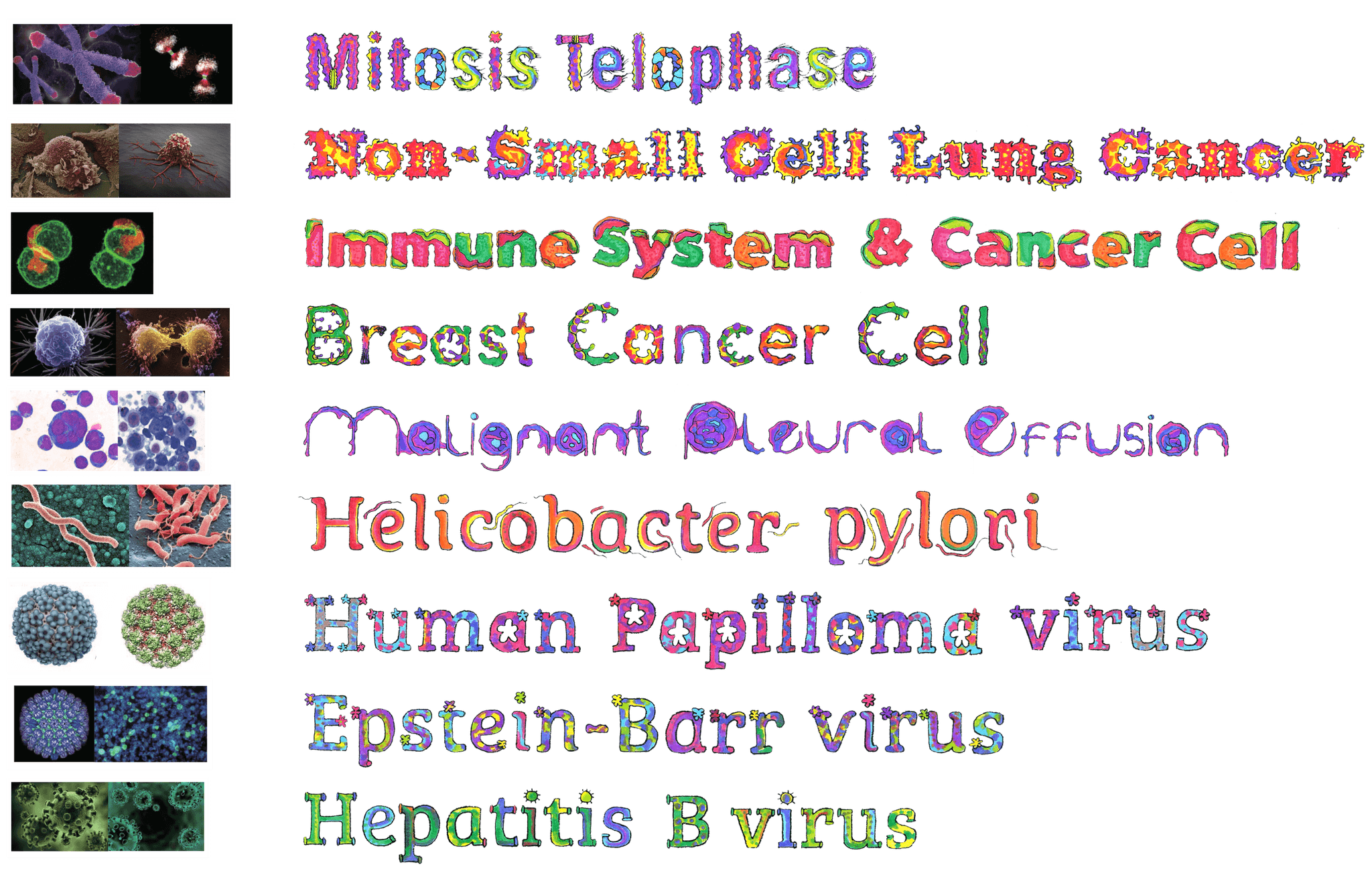
"aí" is a branding design uses the shapes and colors of cancer cells to create a custom typeface and product designs. Through these, it aims to help people better understand and empathize with the experiences of cancer patients.
Project Introduction
The "aí" branding and visual design project is inspired by the song Cancer, which explores the emotional journey of cancer patients, from fear and struggle to reflection and acceptance. Through this project, I aimed to channel the organic and emotional aspects of cancer into typography and product designs, encouraging people to empathize with and face cancer as a reality.
By transforming the shapes and colors of cancer cells into a unique typeface, and applying this to everyday products, this project symbolizes the human experience of illness and resilience.
Research and Inspiration
To capture the essence of cancer, I studied the unique shapes and textures of cancer cells under a microscope. Their irregular and organic structures inspired the letterforms, while their vivid and sometimes unsettling colors informed the project’s emotional tone.
Cancer cells' asymmetrical forms and biological complexity became the basis for the typeface's unconventional shapes.
Cancer cells don’t have intrinsic colors that we can see with the naked eye; the colors seen in scientific imagery are usually added through staining techniques or enhanced for visibility. For this project, I used deep reds, purples, and blues inspired by these scientific images to evoke emotional intensity and create a visually cohesive and impactful design language.
The broken and uneven shapes of cancer cells show the struggles patients face, and I used this idea in my designs.
Typography and Design Meet the Shape of Cancer
The shapes of cancer cells inspired both the typography and product designs in this project. Each letter reflects the irregular and organic forms of cancer cells, while the products integrate these shapes and patterns to create a cohesive and meaningful design language.
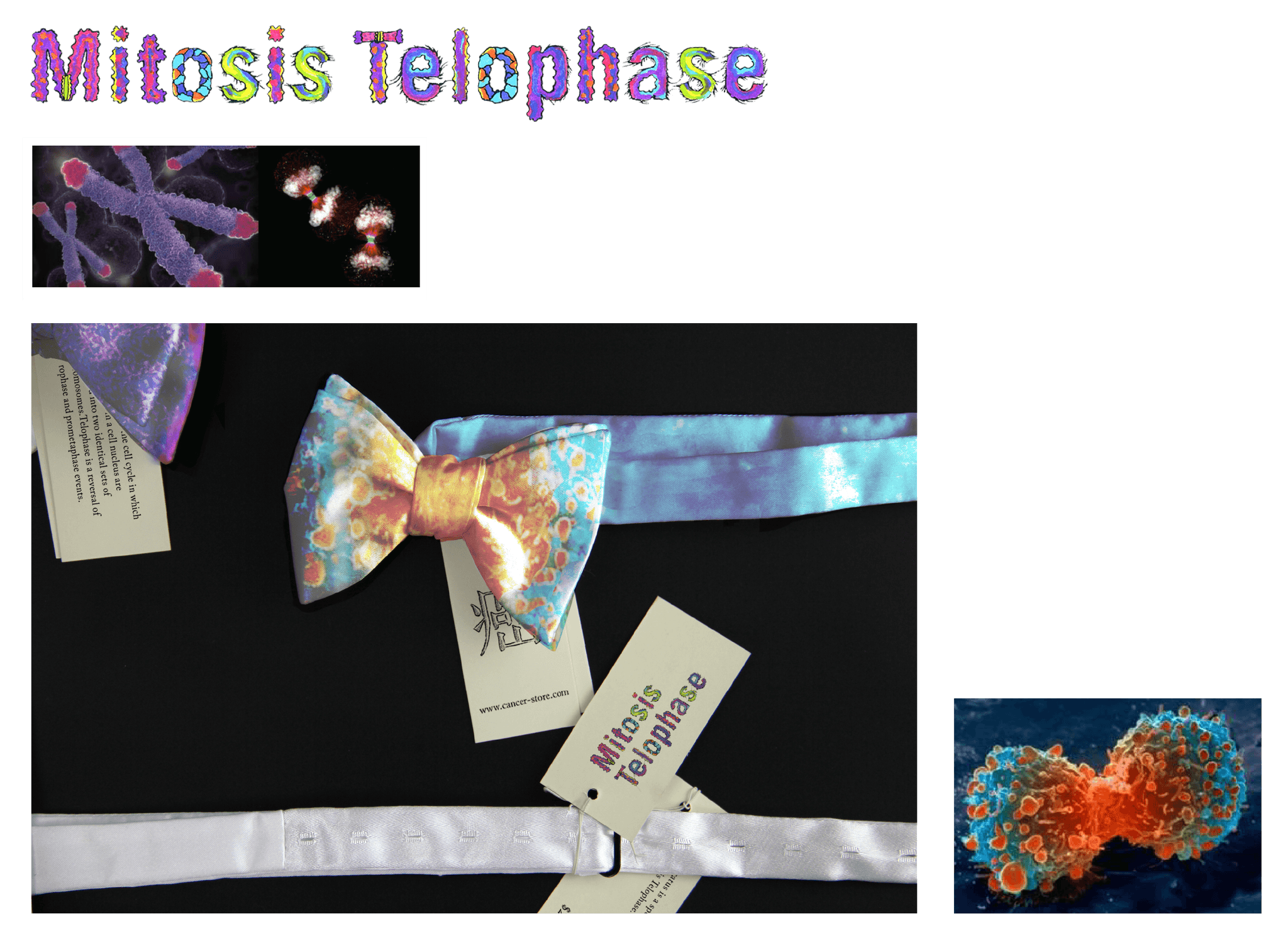
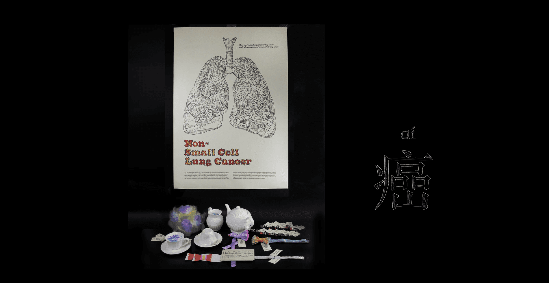
During mitosis, in the telophase stage, the cell looks like a bow tie. This shape appears because the two new nuclei form at opposite ends of the cell, while the middle of the cell pinches in as it prepares to divide. The two nuclei are like the "knots" of the bow tie, and the pinched middle is the "band."
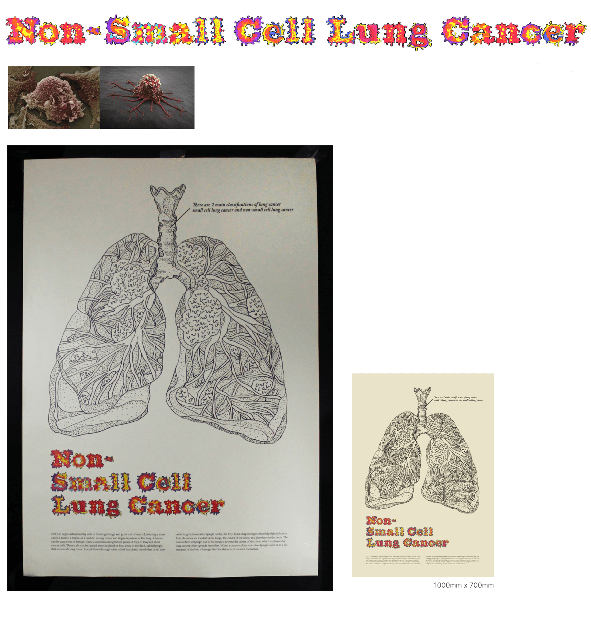
Non-Small Cell Lung Cancer (NSCLC) happens when lung cells grow out of control, forming a tumor. Cancer can spread through blood or lymph fluid to small bean-shaped lymph nodes, often in the chest, in a process called spreading or metastasis.
I designed a simple hand-drawn lung diagram to show a tumor and use arrows to illustrate how it spreads. It includes clear, easy labels to make everything simple to understand.
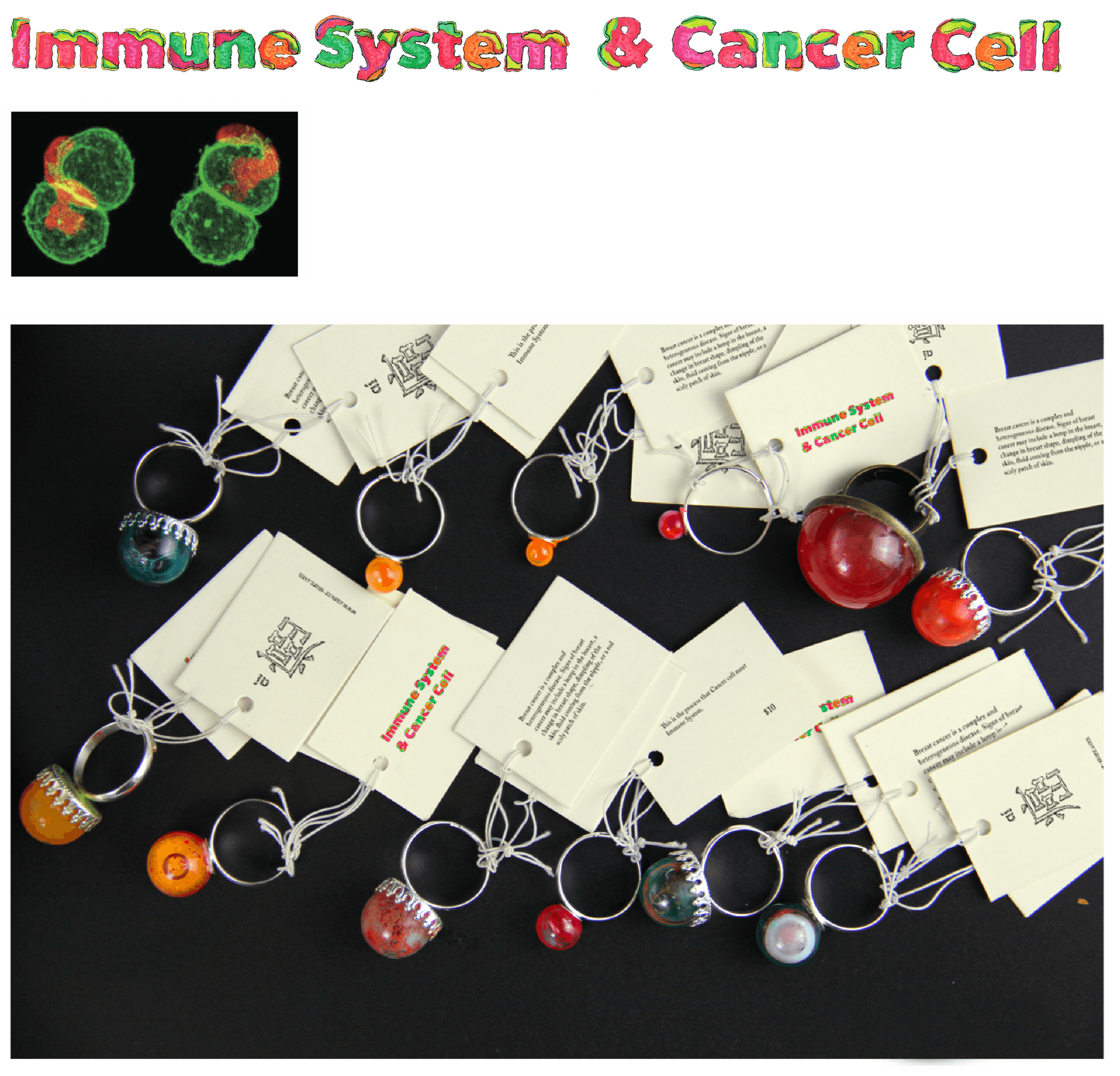
The immune system is the body’s defense, made up of various structures and processes that protect against disease. I designed a ring to represent this, inspired by its circular, protective nature, symbolizing unity and defense.
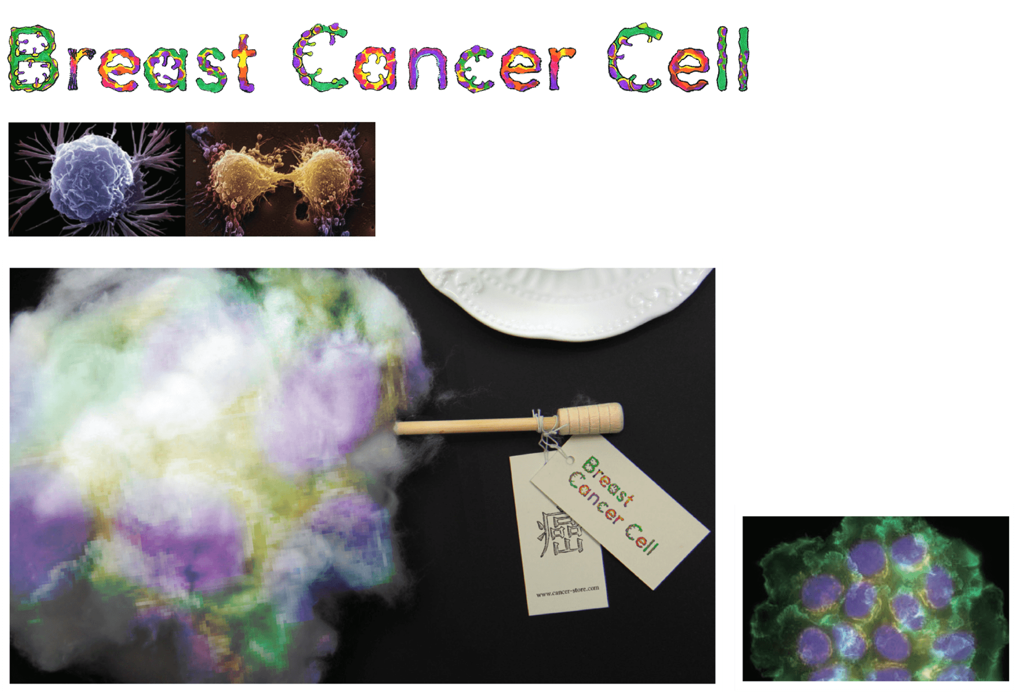
Signs of breast cancer can include a small lump, a gentle change in breast shape, slight dimpling of the skin, a bit of discharge from the nipple, or areas of red, textured skin. To represent this, I designed the breast cancer cell to resemble candy—soft, delicate, and beautiful—reflecting the grace and resilience of women while offering a comforting and hopeful perspective.
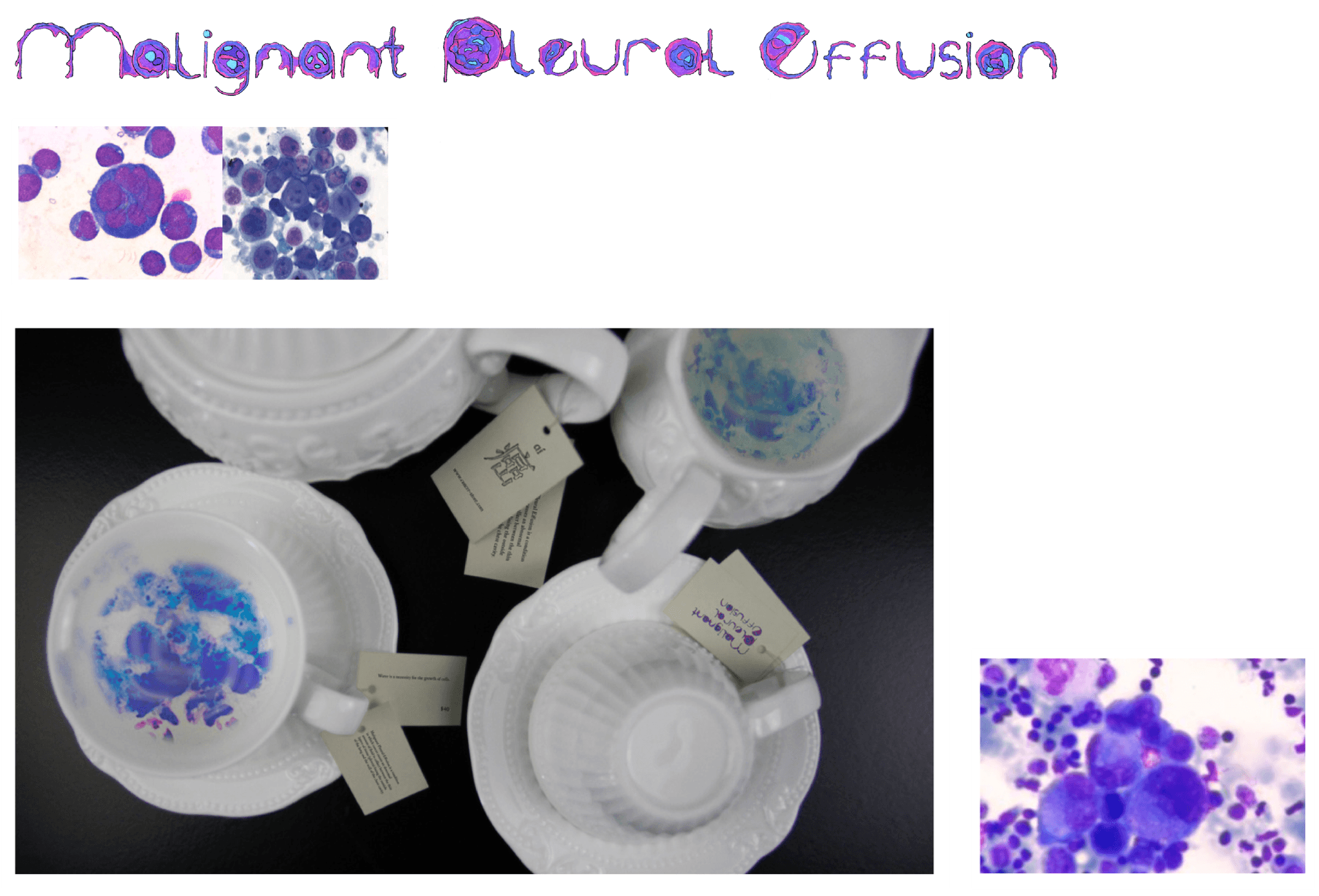
Malignant pleural effusion occurs when cancer leads to an abnormal buildup of fluid between the layers of tissue (pleura) surrounding the lungs and chest cavity. The cells associated with this condition rely on the presence of fluid, much like how patterns on certain cups only become visible when filled with hot water. This design symbolizes the hidden nature of the condition, revealing its essence when the environment changes.
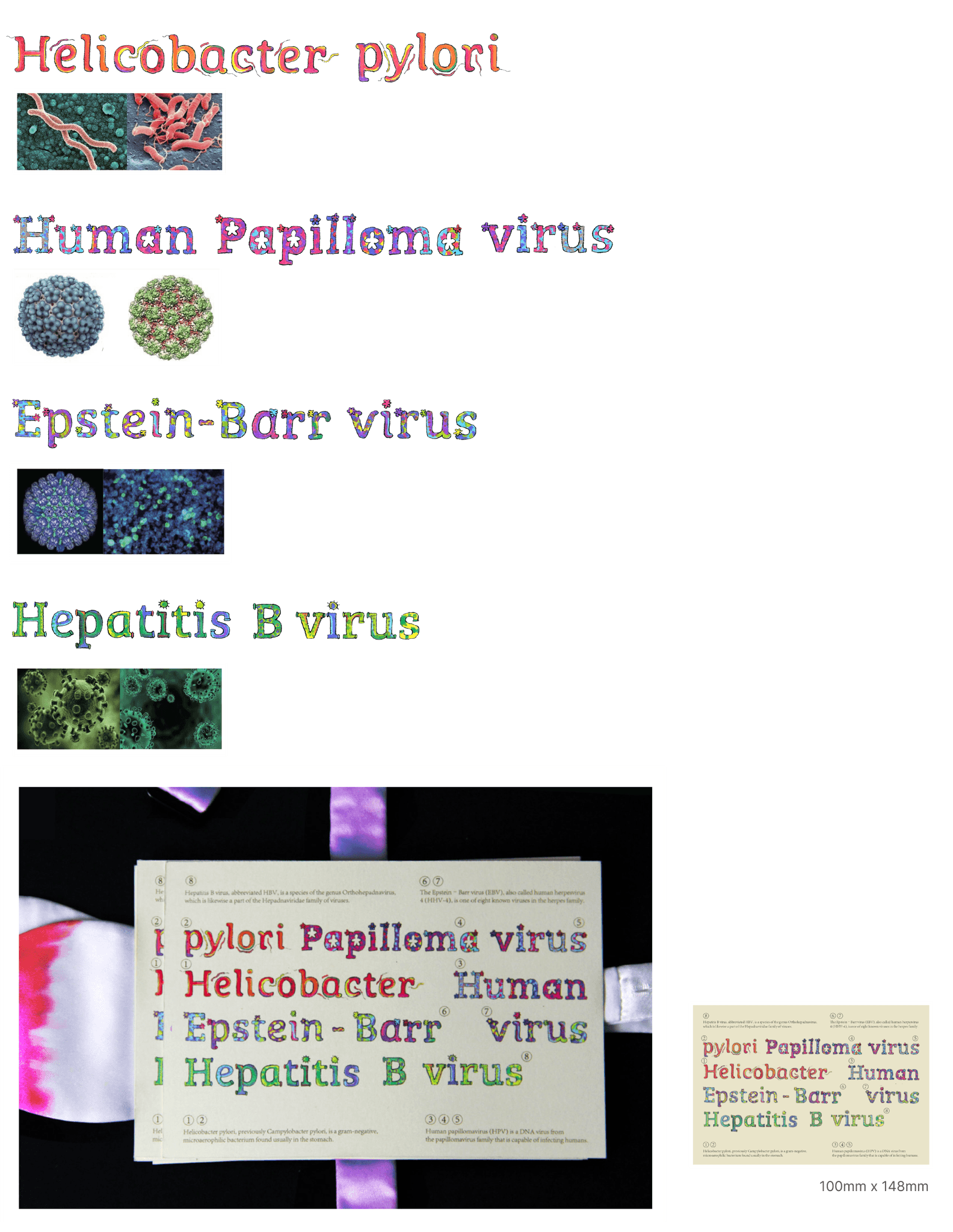
Helicobacter pylori, a gram-negative bacterium, thrives in the stomach. Human papillomavirus (HPV), a DNA virus, infects humans, while Epstein–Barr virus (EBV), also called human herpesvirus 4, is one of the most common herpes family viruses. Hepatitis B virus (HBV) belongs to the Hepadnaviridae family and is a significant health concern.
I designed a postcard as a symbolic carrier to reflect the idea of cancer cells spreading through contact. The design highlights the invisible yet impactful pathways of infection, using the postcard’s journey as a metaphor for the spread and communication of disease.
Designed by Winnie • 2024
